You're staring at a Story export that looks clean on desktop, then it lands on a phone and the hook feels cramped, the CTA sits too low, and the whole thing gets swiped past before the message lands. That's the frustration with a video editor for Instagram Stories, the tool itself often isn't the issue, the layout logic is.
Instagram Stories are now a crowded daily attention channel, with more than 500 million accounts using them every day and about 86% of Instagram users using Stories overall, so tiny layout mistakes get punished fast. They're also capped by format constraints, with Story videos up to 15 seconds in the verified data here, which is why editing choices have to serve both speed and clarity, not just visual polish. Instagram Stories stats
Why Instagram Stories Editing Is an Interface Problem, Not Just a Crop
The first mistake many users make is treating Story editing like a resize job. They export a vertical file, upload it, and assume the platform will do the rest, then wonder why the Story feels harder to read than the same clip did in the timeline.
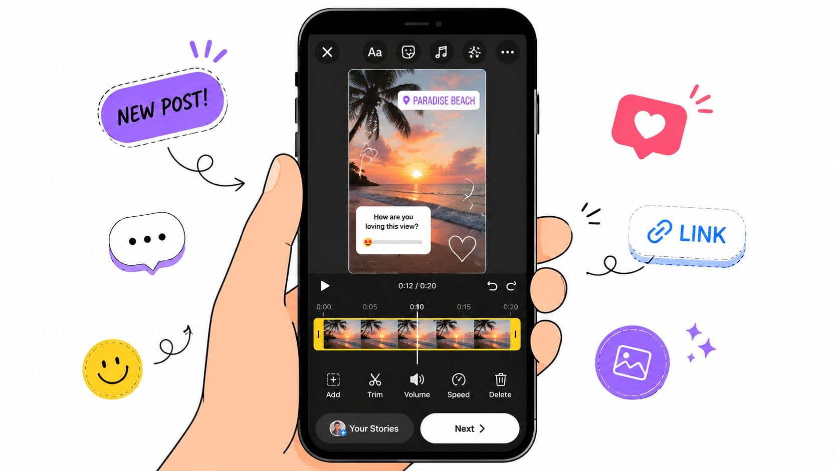
Instagram doesn't show your video in a vacuum. The screen already carries the profile bar, reply field, sticker stack, tap zones, and whatever else the viewer is doing with one thumb, so the design task is to protect your message inside a crowded interface.
Design for what the viewer sees, not what your timeline shows
A Story competes with UI before it competes with another creator's content. That means text hierarchy, CTA placement, and product labels matter more than filters or fancy transitions, because the viewer is scanning while the app is still occupying part of the frame.
Practical rule: if a key word matters, don't trust the auto-crop to protect it. Put the important line where the phone UI can't bury it.
The contrarian part is simple. As Instagram ships its own Edits app and third-party tools race toward one-click automation, the creators who keep winning are the ones who preserve manual control over overlays, pacing, and text hierarchy. The interface is the canvas, and the canvas is already partly covered.

A good video editor for Instagram Stories should help you make these layout decisions deliberately. If it only helps you cut the frame to 9:16, it's solving the easiest part of the job.
What to favor in an editor
Look for tools that let you:
- Move text freely, instead of locking you into rigid template positions.
- Preview overlays on a phone-shaped canvas, so you can see collisions early.
- Control pacing frame by frame, especially at the first and last moments.
- Keep captions readable, without covering the subject or the CTA.
The editing win isn't “more automation.” It's fewer surprises when the Story hits a real screen.
Planning the Story Before You Touch the Timeline
A Story usually fails before the editor opens. The wrong unit gets chosen, the hook gets shot too late, and the creator tries to salvage it with trimming and text overlays that were never going to fix the structure.
Start by deciding whether the content should be one frame or a sequence. A product tease may work as a single sharp moment, while a mini narrative, a talking-head cutdown, or a demo with a link sticker often needs multiple frames so the viewer has a reason to keep tapping through.
Match the format to the outcome
A Story isn't just “vertical video.” It's a format with a job. If the goal is awareness, the first frame needs to carry the idea immediately. If the goal is action, the sequence needs room for proof, context, and a clear end frame that tells people what to do next.
Good planning also changes how you shoot. Leave breathing room at the top and bottom, keep the subject centered enough to survive reframing, and capture a stronger opening than the one you might use for Reels or feed posts. Stories reward momentum, so the first visual beat has to work even before the caption appears.
A simple prep routine keeps the edit from turning into damage control:
- Write the content brief first. Define the goal, the action you want, and the single idea the viewer should retain.
- Build a shot list. Include hook, proof, reaction, and end frame.
- Prep assets for vertical use. Captions, logos, product photos, and link text should already be organized.
- Identify the first three seconds. If the opening doesn't work without context, it's too soft for Stories.
If you want a useful shorthand, think retention before polish. A clean Story that loses the viewer is worse than a rougher Story that keeps them moving.
The strongest Stories usually feel planned for the thumb, not rescued by the timeline.
The Retention-First Editing Sequence That Cuts Revision Loops
The fastest Story workflows don't begin with cutting. They begin with selection. Import the full source first, then scan for the hook, proof, and reaction moments that can survive vertical compression, because those decisions shape everything else downstream.
After that, reframe to 9:16 before you get obsessive about captions. Framing affects where the text can sit, how much of the subject stays visible, and whether the pacing feels cramped, so doing it early prevents the most annoying revision loop, where captions are perfect but the crop is suddenly wrong.
The order matters more than the tools
The best sequence is straightforward, but only if you keep it in order:
- Import the full source. Work from the original, not from a trimmed derivative.
- Detect candidate moments. Mark hooks, proof points, and reactions before you cut.
- Reframe to 9:16. Decide what the viewer needs to see inside the vertical frame.
- Clean captions. Fix line breaks, timing, and readability after the frame is stable.
- Batch export. Save all versions together so you're not repeating the same work.
That order works because each step informs the next one. If you clean captions before reframing, you'll move them again later. If you trim before identifying the hook, you'll keep guessing at pacing instead of editing toward a decision.
The older manual method is still common, and it's slow for a reason. It usually means duplicating the video for vertical use, hand-cropping each section, trimming clips individually, adding captions, then exporting and uploading every segment one by one. That's the bottleneck Story repurposing hits over and over.
If you're looking for a workflow that organizes that sequence in a more structured way, the AI video editor approach can help, especially when the raw material is already strong and the task is assembly, pacing, and export discipline.
Why the Best Story Editor May Be the One That Does Less
Aggressive automation looks great in a feature list and causes problems on the phone. Auto-crop can save time, but it can also place a hook line under the profile bar, swallow a CTA in the reply tray, or bury a product label behind a sticker stack.
Those are not minor misses. They change whether the viewer can read, tap, or respond. A Story that's technically exported correctly can still underperform because the layout made the action harder than it needed to be.
Common failure modes are predictable
The most common mistakes show up in the same places:
- Top edge clipping, where the hook line gets hidden by the interface.
- Bottom crowding, where the CTA lands too close to the reply field.
- Sticker collisions, where product tags or countdowns fight for the same space.
- Over-automation, where the editor makes a choice you needed to make yourself.
That's why manual control still matters. If you can place overlays yourself, adjust pacing without fighting the software, and keep text hierarchy intact, you'll usually end up with a cleaner result than a tool that tries to “optimize” everything for you.
Instagram's own editor presence changes the calculation too. If the platform is already giving creators a native way to create and edit video, third-party tools need to win on precision, not just convenience. The editor that lets you do less blindly is often the one that protects performance better.
Use tools for speed, not for judgment
Some tools are useful for draft generation, repurposing, or first-pass assembly. Hooked, for example, can generate short-form video drafts from ideas or inputs, which is helpful when you want a structured starting point rather than a blank canvas. But the final Story still needs human judgment on what sits where and why.
That distinction matters because Stories are read inside a live interface, not viewed as a standalone video file. When the layout is right, the automation becomes a time saver. When it's not, it becomes a liability.
Safe-Zone Layout Rules That Keep Stories Readable and Tappable
The easiest way to audit a Story is to think in bands. The top band is where profile UI and title elements can interfere, the bottom band is where reply and reaction areas become a problem, and the middle band is where the most important content should usually live.
If you remember nothing else, remember this. Critical words belong where the interface can't crowd them out, and the viewer should be able to grasp the message without waiting for the app to stop competing for space.
A practical layout map
| Screen Band | UI Overlay | Safe for Critical Content | Recommended Content |
|---|---|---|---|
| Top band | Profile bar and top interface elements | No, keep it light | Ambient visuals, background texture, nonessential detail |
| Middle band | Least crowded viewing area | Yes | Hook text, main message, face, product focus, key CTA |
| Bottom band | Reply field, reaction area, sticker stack | Limited | Supporting stickers, secondary labels, noncritical end-frame elements |
Use the middle band for the strongest line in the Story. Keep the primary hook above the profile bar zone, and don't place a CTA so low that it fights the reply field or gets ignored when the viewer taps through.
What belongs where
- Primary hook: place it in the upper-middle or true middle band, where it can be read immediately.
- CTA text: center it in the middle safe band, especially if the Story depends on clicks or replies.
- Stickers and interactive elements: reserve space for them rather than forcing them onto the same line as a headline.
- Product tags and labels: keep them away from crowded edges, because they're the easiest thing to lose in a tight export.
Tap-through behavior matters too. A viewer moving quickly is less forgiving of cramped layout, so the Story needs to feel instantly legible. If a finger or thumb movement makes the text harder to read, the design is doing too much work in the wrong place.
A safe-zone audit should happen before export, not after posting. If the message can't survive the overlay map on a vertical phone screen, the editor hasn't finished the job.
Choosing an Editor by Content Type and Outcome
The right editor depends on what you make most often. A faceless AI Shorts workflow, a talking-head cutdown, a product demo, and a multi-slide Story sequence all have different pressure points, so ranking apps by feature list misses the actual decision.
If you publish mostly quick repurposed clips, you'll care about speed and batch handling. If you sell products, you'll care more about manual placement, readable captions, and space for link stickers. If you build narrative sequences, you'll care about pacing control and clean frame transitions.
Match the tool to the job
Instagram's native Edits app makes sense when you want a tighter in-app workflow and don't need a heavy external pipeline. Canva fits creators who want template-driven design and simple vertical packaging. Kapwing and VEED tend to make sense when the work is fast repurposing, resizing, and assembly across multiple formats.
For more automated short-form generation, Hooked's Instagram Reels generator sits closer to the “generate and refine” end of the spectrum, which can be useful when the input is a script, product page, or trend prompt and the output needs to move quickly into a publishable draft.
If you're also building audio into the Story, a resource like generate tracks for short videos can help when you need background music that matches the pace of the cut instead of bolting on a generic track after the edit is done.
Screenshot from Hooked

Choose by outcome, not novelty. If the goal is a polished template, use the tool that gives you predictable layout. If the goal is volume, use the tool that reduces assembly time. If the goal is Story readability on a phone, use the tool that gives you manual control where it counts.
CTAs, A/B Testing, and a Weekly Optimization Loop
The cleanest CTA is the one the viewer can see without competing with the interface. Keep it in the middle safe band, and make sure the wording matches the action you want, whether that's a reply, a link tap, or a swipe to the next frame in a sequence.
From there, test one variable at a time. Change the hook line, not the hook line and the sticker placement. Change the first frame, not the caption style and the CTA wording together. That discipline is what makes Story performance readable instead of noisy.
Build the loop around the metrics that matter
The key Story metrics are reach, impressions, taps forward/back, exits, replies, shares, and link clicks. Completion and exit behavior matter because Stories are watched in a fast-moving environment, and benchmark reporting shows they typically achieve around 70% to 87% completion rates, with one benchmark citing an average of 87% across nearly 15,000 accounts over six months and another reporting a 70% average with a 5% exit rate. Instagram Stories statistics
Use those metrics as feedback, not decoration. If a Story gets the view but loses the viewer early, the opening needs work. If replies or link clicks stay flat, the CTA probably isn't visible enough or the offer isn't clear enough in the frame.
Weekly rule: test one change, keep the rest steady, and review the result before publishing the next batch.
A content scheduler can help turn that review into a repeatable habit. Hooked's content scheduler is one example of a tool that supports publishing and analysis in the same workflow, which matters when you want the edit, publish, and review cycle to stay tight.
The true payoff comes from treating every Story as a small experiment. Once the layout is safe, the CTA is visible, and the metrics are tracked with discipline, the editor stops being just a production tool and becomes part of a weekly optimization loop.
If you want a workflow that connects Story ideas, fast editing, and scheduled publishing without turning the process into guesswork, visit Hooked. It gives creators a structured way to generate short videos, refine hooks, and keep production moving across platforms. If your Story process still breaks at the export stage, this is the kind of system worth testing.