

You've made the images, written the caption, and opened TikTok ready to publish. Then the first slide appears in the preview and feels more like a folder of photos than a reason to keep swiping. That moment decides the post's ceiling. A TikTok slideshow doesn't win because it contains attractive images. It wins because every frame earns the next swipe, delivers a useful payoff, and gives viewers a reason to save or share it.
Why TikTok Slideshows Hook Viewers Differently Than Video
A video can create momentum through motion, speech, and editing. A slideshow has to create momentum through curiosity and sequence. The viewer sees one still frame, decides whether the promise is worth pursuing, and then actively controls the pace. That makes the first slide less like an introduction and more like a thumbnail with a job to do.
TikTok officially introduced its slideshow feature, Photo Mode, in October 2022. The native format lets creators publish multiple still images, pair them with music, and let viewers swipe at their own pace, as documented in TikTok's Photo Mode launch coverage. The change mattered because creators could build tutorials, product explainers, and story arcs inside TikTok without turning every idea into a filmed edit.

Choose sequence over motion when the idea needs room
Use Photo Mode when the viewer benefits from controlling the pace. A skincare brand can reveal a routine step by step. A faceless finance channel can turn one concept into a sequence of definitions, examples, and a final checklist. An ecommerce team can show a product from several angles without forcing viewers to pause a fast video.
The format also changes what success looks like. Views tell you that the opening reached people, but swipes, completions, saves, and shares tell you whether the sequence held attention or created lasting utility. A slideshow that gets revisited or saved may be doing a better job for a tutorial or product consideration campaign than one that gathers passive views and disappears.
For daily content planning, I use TikTok storytelling trends as a source of format prompts, then adapt the pattern to the audience's question. The shortcut isn't copying a visual style. It's recognizing whether the trend supports a reveal, a list, a lesson, or a progression.
Preparing Your Slideshow Assets for Maximum Impact
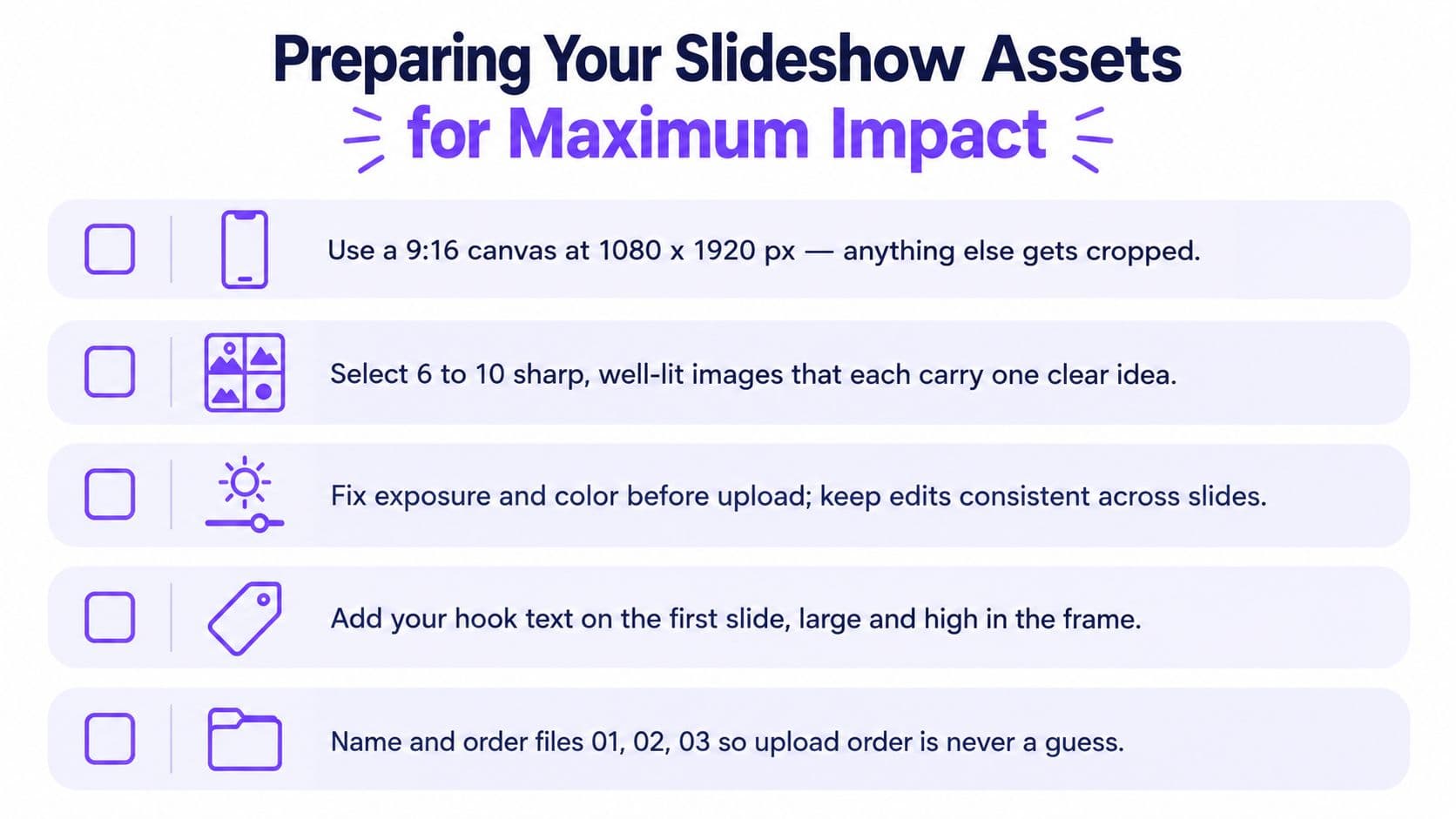
A slideshow editing session starts before TikTok opens. Prepare the canvas, images, copy, and upload order first. This catches cropped text, inconsistent color, and a weak opening before they cost swipe-through. For faceless channels and brand accounts, the asset folder should already reflect the retention path: Hook → Value → CTA.
Start with a 9:16 vertical canvas at 1080 × 1920 pixels. This fills the TikTok screen and reduces awkward cropping, as recommended by SocialBee's slideshow guidance. Export every slide at the same dimensions. A square image beside a full-screen design creates visual friction, especially when text shifts between frames.
Build the asset pack before you assemble
Use this preparation order:
- Define the promise. Write one sentence describing what the viewer will learn, decide, or discover.
- Create the hook slide. Lead with a bold claim, question, mistake, or contrast. Skip a title card that delays the payoff.
- Select the supporting images. Choose sharp visuals that each communicate one idea. Remove frames that merely repeat the previous slide.
- Write concise overlays. Aim for 10 to 15 words per slide, a practical range discussed in Metricool's TikTok slideshow guidance. Use it as a writing target, not a guarantee.
- Finish with one CTA. Ask for one action, such as saving the post, commenting with a question, or visiting a product page.
Keep most decks within 5 to 15 slides, adjusting length to the narrative rather than padding the sequence. A short list needs fewer frames than a detailed tutorial. Each added slide should introduce a new payoff, proof point, or necessary transition, otherwise it gives viewers another chance to swipe away.
Make readability a design constraint
Place important text away from the edges and use strong contrast. Viewers should understand each slide without zooming, and the visual should still work with the sound off. Keep font, color treatment, and text placement consistent enough for the deck to feel like one piece.
For desktop image batches, Mac app for Instagram-ready photos can help standardize export decisions before files reach TikTok. If the sequence needs motion, image-to-video creation can turn prepared assets into a moving version, but movement cannot repair weak sequencing.
Name files in upload order, such as 01-hook, 02-point, and 03-example. Then review the deck as a viewer would. If slide two does not create curiosity about slide three, rewrite that transition before publishing. Save the final frame for a clear action, because a useful CTA gives viewers a reason to save or respond instead of ending at the last fact.
Building Your Slideshow in TikTok and With Hooked Shortcuts
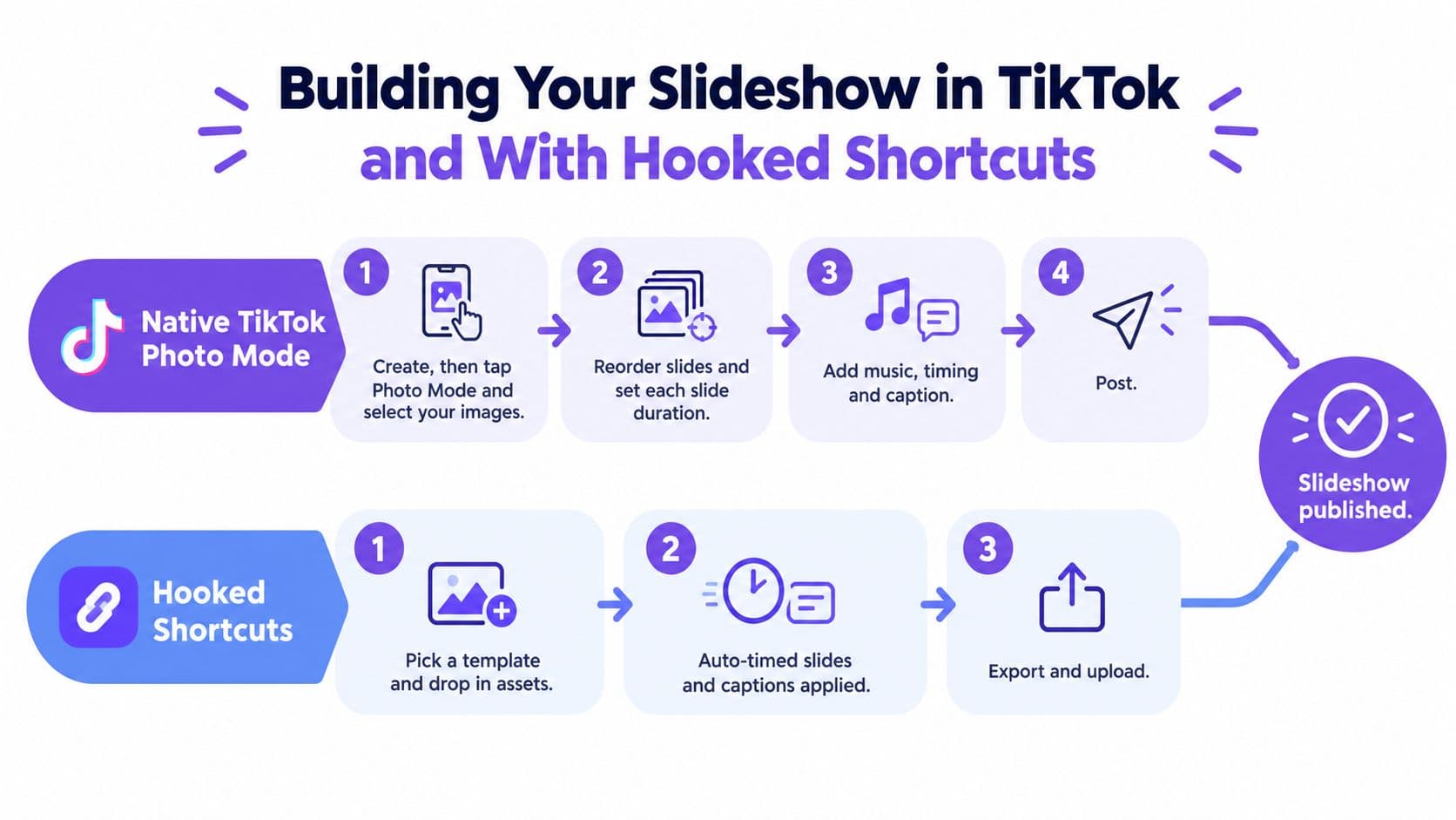
TikTok's native workflow is straightforward, but one setting determines whether viewers swipe manually or watch an automatically advancing edit. Open the creation screen, choose Create, upload your images, and select the photo-based mode when TikTok presents the available formats. Reorder the images so the hook appears first, then review the progression in sequence.
The native TikTok route
Use this workflow when you want direct control inside the app:
- Tap the create button and choose Upload.
- Select multiple images from the photo picker.
- Confirm that TikTok is using Photo Mode, not an automatic template.
- Reorder the slides and review the preview.
- Add music, text, stickers, or filters where they support the message.
- Adjust timing where TikTok gives you that control.
- Write the caption, review the cover frame, and publish.
The reason to check the mode explicitly is practical. A manually swiped carousel and an auto-advancing image edit create different viewing experiences. If your tutorial depends on the audience reading each frame, automatic transitions can move people forward before they've absorbed the point.
TikTok's Photo Mode launch also allowed captions of up to 2,200 characters, according to the launch reporting linked earlier. That gives brands room to add searchable context, but more caption space doesn't mean every post needs a long caption. Use the caption to clarify the promise, add relevant terms, and answer the question implied by the hook.
The faster production route
For faceless channels, UGC-style ads, and product carousels, a shortcut can reduce repetitive assembly. Hooked offers copyable viral formats, AI-generated scripts, drag-and-drop editing, and natural-sounding voiceovers in 29 languages. Treat it as a production option, not a substitute for reviewing the hook, pacing, and brand accuracy yourself.
A useful workflow is to choose a format that matches the idea, add the prepared images, generate or paste the script, and adjust the timing so the narration lands with the relevant slide. Add captions when the voiceover carries essential information, especially for silent viewing. If the visuals already communicate the point, keep overlays lighter rather than duplicating every spoken sentence.
Here's a visual walkthrough of the two production paths:
A public 2026 report compiled from TikTok slideshow examples recorded 130.4 million total plays, 1.3547 million total shares, and a median slide count of 11 across its dataset, as reported in the slideshow statistics report. Those figures don't promise a result for your post. They do show why the format deserves a real workflow instead of being treated as an afterthought.
Structuring Slides for Swipe Through and Completion
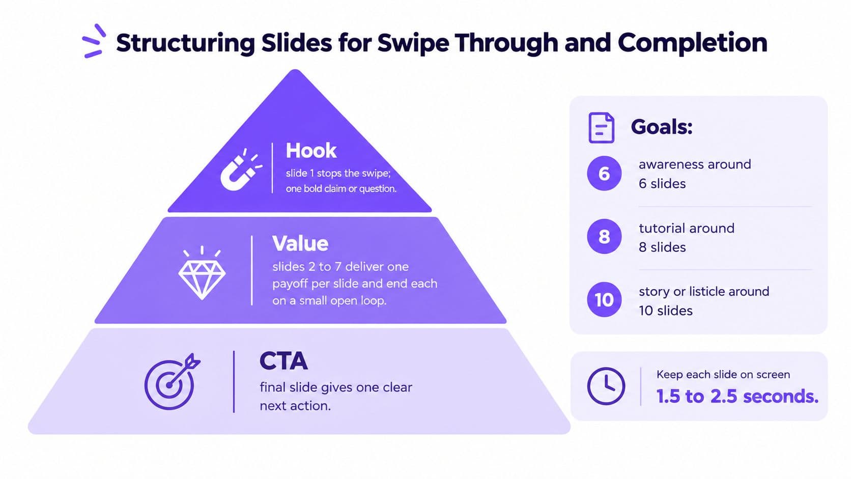
A slideshow loses viewers when slide two answers the question from slide one. Build each frame to release just enough information to justify another swipe. The working system is Hook → Value → CTA: the hook earns attention, the value earns completion, and the CTA converts that attention into a save, share, comment, or click.
Give every slide a distinct job
Slide one should make one clear promise. “Three product photos” describes the asset, while “The feature most shoppers miss” creates a question the next frame can answer. A tutorial can open with the finished result before explaining the steps. A listicle can lead with its most counterintuitive point instead of a generic title.
Middle slides should deliver one payoff at a time. Use an example, comparison, screenshot, or other visual proof, then make the next point feel like a natural continuation. Avoid splitting one short sentence across several frames just to increase the count. That tactic may raise slide views while weakening completion and saves.
Select length by the goal
Use 5 to 10 slides for most decks, and extend toward 15 slides when a tutorial, case explanation, or multi-part story needs more room. Keep awareness posts near the shorter end when they have one takeaway. Choose length based on the amount of proof or instruction required, not a fixed target.
| Content goal | Useful structure |
|---|---|
| Awareness | One hook, a few supporting points, one memorable close |
| Tutorial | A promise, ordered instructions, a final checklist |
| Product consideration | Problem, feature evidence, use case, action |
| Story or listicle | Escalating points, strongest proof before the close |
Place the strongest proof before the CTA. The final frame should make the next action obvious, rather than trying to recover a sequence whose best idea appeared too early. For broader presentation principles on how to captivate your audience, study how information is revealed, then tighten the copy for TikTok's faster swipe decisions.
A practical test is to review the deck without audio and ask what each slide contributes. If removing a frame changes nothing, cut it. If a slide needs several rereads, simplify the wording or give the viewer more time. Dense writing rarely becomes clearer by adding another dense frame.
Pro Tips to Boost Engagement Saves and Shares
A slideshow can earn a swipe without earning a save. The difference usually comes from clarity, useful proof, and a final action that fits the promise. Dense slides make viewers work before they reach the next frame, so shorten the copy and protect the visual space. Replace “Our platform provides a complete workflow for consistent social media growth” with “Plan, create, and schedule in one workflow.” The second version scans faster and gives the design room to breathe.
Short text also supports stronger swipe-through. In creator testing, slides with 10 to 15 words often moved viewers forward more effectively than slides with 20 or more words. Treat that range as an editing benchmark, not a guarantee. Remove words that do not clarify the claim, prove the point, or set up the next frame.
Write CTAs for the behavior you want
“Follow for more” asks for an ongoing commitment from someone who may have discovered only one useful post. Tie the CTA to the value already delivered:
- For reference content: “Save this checklist before your next launch.”
- For discussion: “Which step causes the biggest delay?”
- For product intent: “Compare the features on the final slide.”
- For sharing: “Send this to the teammate who edits every post.”
Clear save prompts can improve save behavior, but the result depends on whether the deck deserves to be kept. Ask viewers to save a checklist, framework, comparison, or process they can use later. A generic request adds friction without giving them a reason.
Match audio to the reading task
Music should set the mood without competing with the text. Educational slides usually work better with a restrained soundbed, while a visual reveal can use a stronger transition to mark the change. If you add voiceover, write it to the slide order. Do not narrate information that is absent from the frame, because viewers may read and listen at different speeds.
Recent coverage reports a median 3.4% engagement rate for slideshows versus 2.8% for videos and describes slideshows as strong for rewatching, as summarized in this slideshow versus video analysis. Use saves, replays, and completion as separate signals when reviewing an informational deck. Swipe-through shows whether the hook earns the next frame. Saves show whether the value survives after the session. A slideshow does not need to behave like a video to strengthen a broader content mix.
Publish Schedule and Scale What Works Next
Before publishing, inspect the deck once on a phone. Confirm that the cover makes sense without context, the text isn't trapped near the edges, the music fits the reading pace, and the caption supports the search intent. TikTok allowed captions up to 2,200 characters at Photo Mode's release, according to the launch report, so use the available space when a fuller explanation helps.
Review the post for four practical checks:
- Hook: Does slide one create a specific question or promise?
- Sequence: Does every slide add information rather than repeat it?
- Action: Does the final frame ask for one relevant behavior?
- Distribution: Have you checked music rights, hashtags, and the intended publishing workflow?
After publication, separate reach from usefulness. Study which hooks attract swipes, which decks earn saves, and where viewers stop progressing. Then change one variable in the next post, such as the opening claim, slide count, proof order, or CTA wording. A repeatable testing habit teaches you more than endlessly redesigning one deck.
For teams publishing across several channels, a content scheduler can organize repurposing and planned distribution. Turn a successful TikTok sequence into an Instagram carousel, a short video script, or a LinkedIn document only after adapting the pacing and call to action for that platform.
Start with two versions of the first slide, publish the stronger concept, and keep a record of saves, shares, and completion behavior. Build a 30-day rhythm around recurring audience questions, then let the winning structures guide the next batch instead of starting from a blank canvas every day.
Hooked helps creators and brands turn repeatable formats into TikTok slideshows and other short-form content with AI scripts, drag-and-drop editing, voiceovers, and cross-platform scheduling. Visit Hooked to build your next slideshow workflow, test stronger hooks, and publish consistently without rebuilding every post from scratch.


